Goals and Background
The main goal of this lab is to gain knowledge and understanding on how to use two classifications algorithms. These classifiers make use extremely robust algorithms which have proved effective for increasing classification accuracy of remotely sensed imagery. These algorithms are much more effective and accurate than traditional unsupervised or supervised classifications methods. The two main objectives for the lab were as follows:
1. Learn how to divide a mixed pixel into fractional parts to perform spectral linear unmixing
2. Demonstrate how to use fuzzy classifier to help solve the mixed pixel problem
Methods
Part 1: Linear spectral unmixing
For the first portion of the lab ENVI or Environment for Visualizing Images software. The step is to perform spectral linear unmixing on a ETM+ satellite image of the Eau Claire and Chippewa Counties. After the image is opened in ENVI the available band list window opens and in this case we have 6 bands 1-5 an band 7. Once this list is open we select a band combination of 4, 3, 2 so that the image displays in false infrared. Once the load band button the image opens in 3 separate viewers, each with a different zoom level aiding in the analysis of the image. After the viewer is open with the three zoom levels the analysis is begun.
Section 2: Production of endmembers from the ETM+ image
First the image had to be converted to principle component to reduce and remove noise from the original image. This removal of error helps to increase the accuracy when the image classification in conducted later in the lab. To change the image to principle component click compute new statisics-> rotate from the transform drop down. This converts the image to principle component and when brought into the band viewer there will be an additional 6 principal component bands besides the original 6 bands (Figure 1).
 |
| Figure 1 In this band list you can see the additional 6 PC bands. |
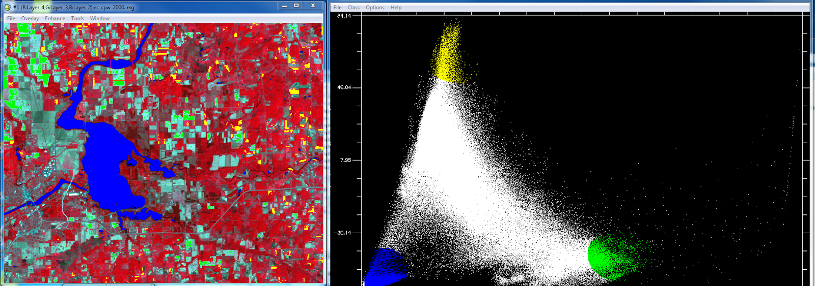
Once the principle bands are created the next step is to examine the scatter plots and find areas agriculture, bare soil, and water in the image that correspond to the selected pixel values in the histograms. In order to this I opened the scatter plots for the PC bands 1 and 2. This is done by selecting 2D scatter plots->scatter plot band choice window. PC band 1 is selected as the X value and PC band 2 is the Y value. Once the scatter plot is open the next step is to collect end-member samples. End-members are collected by drawing a polygon or circle on the scater plot over the pixel values. This is bit of an experimental process as you don't know which LULC classes will be contained in the pixel values you select in the scatter plot however this is why the map window in open so that you can compare the selected pixel values to LULC classes in the map. When selecting end-members you can change the color of your selection and create multiple selections in the same scatter plot. Each of these selections will highlight the corresponding areas in the map in that color. Figure 2 is the scatter plot showing 3 end-member selections. Green in the scatter plot corresponds to agricultural areas in the map, yellow corresponds to bare soil areas and blue corresponds with water feature in the map.
 |
| Figure 2 This is the first set of end-member selections I conducted using PC bands 1 and 2. |
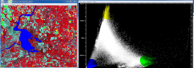
After we had located the agricultural, bare soil and water LULC areas in the map the next objective was to find the urban areas. Instead of using PC band 1 as the X and 2 as Y I used PC band 3 as X and band 4 as the Y. Figure 3 below is the resulting scatter plot of PC bands 3 and 4. Using the same process as before I selected pixel values in the scatter plot trying to highlight only the urban areas in the map. This proved to be more difficult than selecting the other LULC classes via the scatter plot.
 |
| Figure 3 On the right is the scatter plot for PC band 3 and 4 with the end-member slection. On the left you have the selcted urban areas higlighted as purple. |
Once I was finished selecting the end-members the ROIs were saved to be used next when conducting the linear spectral mixing process. Figure 4 is what the window looks like to save the ROIs.
 |
| Figure 4 This is the save ROI window. This window tells you haow many pixels are selected in each of the end-member selections made earlier in the scatter plots. |
Section 3: Implementation of Linear Spectral unmixing
The last step in the unmixing process is to run the linear spectral unmixing. This is done by going to spectral-> mapping methods-> linear spectral unmixing. Bring in the original satallite image and then load the ROIs we just saved in the previous step. ENVI take these two inputs and creates 4 separate output images each with a different LULC class highlighted. Figure 5-8 are the resulting images. The brighter an area is in the image the more likely it is a specific LULC class. For example in the water image, water features will show up as bright white the other LULC classes will be darker grey and black.
 |
| Figure 5 This is the bare soil fractional image. |
 |
| Figure 6 This is the fractional image for water. As you can see the water features were not picked out extremely well. |
 |
| Figure 7 This is the forest fractional image. |
 |
| Figure 8 This is the urban/built up image. |
Part 2: Fuzzy Classification
The second part of the lab was learning how to use a fuzzy classifier. The main point of the fuzzy classifier is to do basically the same task as the linear spectral mixing. It is used to identify mixed pixel values when performing an accuracy assessment. It takes into consideration the fact that there are mixed pixels within the image and that it is nearly impossible to assign those to the correct LULC class perfectly. It usese membership grades where the pixel values are decided based on whether it is closer to one LULC class compared to the others. The are two main steps in this process.
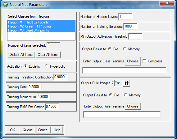
Section 1: Collection of training signatures to perform fuzzy classification
The first step is to collect training signatures to perform the fuzzy classification. Just as in
Lab 5 I collected training samples however this time the process was a bit different. Instead of collecting only homogeneous samples like in lab 5 we collected both homogeneous and mixed samples. The collection of both types of samples gives the program a better idea of how things occur in real life. This results in a more accurate classification overall. For this lab I collected 4 water samples, 4 forest, 6 agriculture, 6 urban and 4 bare soil samples. After the samples are collected they are merged just as in lab 5.
Section 2: Performing fuzzy classification
Step 2 is performing the fuzzy classification. Performing the classification is a pretty straight forward process. Open the supervised classification window in ERDAS Imagine and pick fuzzy classification. Then I input the the signature file and which was created in the previous step. The parametric rule is set to maximum likelihood and the non-parametric rule is set to feature space. The best classes per pixel is set to 5 and then the fuzzy classification is run. Once this is run the final step is to run fuzzy convolution which takes the distance file into consideration and creates the final LULC classified image. Figure 9 is the final fuzzy classification image brought into ArcGIS and made into a map.
Results
 |
| Figure 9 This is the final LULC map for fuzzy classification method. |
Source
The Landsat satellite image is from Earth Resources Observation and
Science Center, United States Geological Survey.