Thursday, April 21, 2016

Advanced Remote Sensing Lab 10 : Advanced Classifiers 3

Goals and Background

The main goal of this lab is to learn how to use two advanced classification algorithms. These advanced classifiers are very robust and can greatly increase the accuracy of the LULC classification. The main objectives for the lab are as follows:
1)  Show us how to perform an expert system/decision tree classification with the use of ancillary data
2) Demonstrate how to develop an artificial neural network to perform complex image classification

Methods

Part 1: Expert system classification 

 Section 1: Development of a knowledge base to improve an existing classified image

The first part of the lab is working with a method called expert system classification. This is a very robust classification method that uses not only the remotely sensed imagery but also ancillary data to get a more accurate final classification.
To begin we were given a classified image of the Chippewa Valley (Figure 1). We examined the image and found that there were a number of errors in the LULC classifications. These included urban areas that were labeled as residential when they were clearly industry and many agricultural areas were labeled as green vegetation and vise versa. These errors would be corrected by running this imagery again in the expert system classification to improve the accuracy and get a more realistic classification of the area.
Figure 1 This is a classified image of the Chippewa Valley with errors in the LULC classification.

The first step to running the expert system classification is to create hypothesis and rules for each of the classes we are interested in. To do so we open the knowledge engineer window. Figure 2 is what this window looks like. This was repeated for each of the six classes which are water, residential, forest, green vegetation, agriculture, and other urban.
Figure 2 This is the window to set up the rules for each of the hypothesis or classes in the knowledge file.

Section 2: The use of ancillary data in developing a knowledge base 

Once those 6 hypothesis or classes are entered the next step is to write an argument that will make sure that the other urban class does not get classified as residential urban. There are two arguments that are written one from the residential hypothesis saying that residential will not be classified as other urban and one by the other urban hypothesis saying that other urban will not be classified as residential. These arguments help the classifier better distinguish between the two classes. The same procedure was followed for green vegetation and agriculture. A argument was added to the agriculture saying that agriculture can not be classified as green vegetation and also the opposite is true that green vegetation can not be agriculture again to help the classifier separate those classes more accurately and correct the errors seen in the original classified image we examined. Figure 3 is the final process tree for the expert system classifier. This knowledge file saved for use in the next step of the lab.
Figure 3 This is the final process tree or knowledge file for the expert system classification.

Section 3: Performing expert system classification 

To run the expert the knowledge classifier window is opened once again and the knowledge file or Figure 3 is brought in. This is where you can select which hypothesis or classes you want to include in the classification. In this case we included all of them Figure 4. After the classes to include are selected click OK and the next window is opened (Figure 5). Here we set the cell size to 30 by 30 and select the location and name of the final output classified image. Hit OK and the classifier runs. Figure 11 is the final classified map.
Figure 4 We include all of the classes for this analysis. 
Figure 5 This is the dialogue box to pick the output location of the classified image as well as set some other parameters.

Part 2: Neural network classification 

Section 1: Performing neural network classification with a predefined training sample 

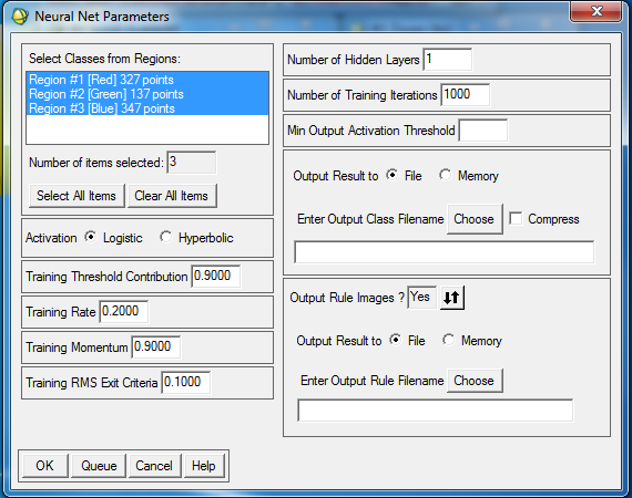
The other method of classification we explored in this lab is called Neural Network classification. This portion of the lab was run in ENVI 4.6.1 another remote sensing software. The first step was to open an image file provided by Dr. Cyril Wilson. Once the image was open the next step was to import an ROI file. These ROIs are training samples that Dr.Wilson collected in this imagery (Figure 6). Once the ROIs are open neural network classification is chosen from the supervised drop down in ENVI. Figure 7 is the parameter window for the classification where the number of iterations, training rate, and output location for the classified image are input. Once the parameters are entered the classification is run and Figure 8 is the result.
Figure 6 This is the image give to us by Dr. Wilson you can see that I have also brought in the ROIs on top of the image.
Figure 7 This is neural network dialogue box where the majority of the parameters are input.
Figure 8 The original false infrared image is on the left and the classified image is on the right.

Section 2: Creating training samples and performing NN classification (Optional challenge section) 

Additional practice and experimentation with the parameters for the neural network classification was done using an image of Northern Iowas campus (Figure 9). I opened the image and instead of having ROIs provided I created them myself. I made three classes which were grass, roofing, and concrete/asphalt. The same procedure for running the classification was followed as above. Figure 10 is the resulting classified image based on the 3 ROIs or classes I created.
Figure 9 This is the original false infrared image of the Northern Iowa campus.
Figure 10 This is the original image on the left and the classified image on the right based on the ROIs I collected.

Results

Figure 11 This is the final LULC map using the expert system classification method.

Sources

The Landsat satellite images are from Earth Resources Observation and Science Center, United States Geological Survey.
The Quickbird High resolution image of portion of University of Northern Iowa campus is from Department of Geography, University of Northern Iowa.


Thursday, April 14, 2016

Advanced Remote Sensing : Lab 9

Goals and Background

The main goal of this lab is to learn the skills involved in performing object-based classification in eCognition which is a top of the line image processing tool. The topics explored in this lab are fairly new to the remote sensing frontier, integrating both spectral and spatial information to extract land surface features from remotely sensed images which in this case is satellite imagery. The main objectives in this lab are as follow:
1) Segment an image into homogeneous spatial and spectral clusters
2) Select appropriate sample objects to train a random forest classifier
3) Execute and refine object-based classification output from random forest classifier
4) Select appropriate sample objects to train a support vector machine classifier
5) Execute and refine object-based classification output from support vector machine classifier.

Methods

Part 1: Create a new project

The first portion of the lab is all about importing imagery into eCognition and setting up a new project. I imported the image set the resolution to 30m/pxl and made sure the geocoding box was selected. Next I changed the color scheme to false infrared by setting a 4,3,2 band combination in the image layer mixing window.

Part 2: Segmentation and sample collection 

Section 1: Create image objects 

The first part of the analysis is creating image objects. This is a grid that is placed over the image made up of many polygons. The polygons shapes are based on parameters set by the user. In order to create this grid a process tree is created. A process tree is where all the commands or tools are placed that the user wants eCognition to run. It is called a tree because it is modeled after a family tree with parents and children which make up the hierarchy of the operations. I created a new process and added a child to it. The child is labeled generate objects and is the tool that created the image object grid. In the generate objects object window the shape was set to .3 the compactness was set to .5 and the scale parameter was set to 9 as seen below in Figure 1. The settings for shape and compactness are decided through trial and error. The goal is to find a combination where the image object polygons are tight to homogeneous objects and pixel values in the aerial imagery. After these are set I hit execute and Figure 2 is what eCognition creates over the imagery.
Figure 1 This is the window set up the generate object process.
Figure 2 This is the image object grid that eCognito creates over the image.

Section 2: Training Sample selection

The next step after the segmentation is to collect training samples. First I created classes of LULC in the class hierarchy. The classes are forest as dark green, agriculture as pink, urban as red, water as blue, green vegetation as light green, and bare soil as yellow (Figure 3).  Once the classes are created training samples can be collected. This is done by selecting a class and then in the image object grid double clicking on polygons that contain that LULC class (Figure 4). This is done for each class and I collected the following number of samples for each class:
  • Forest 10
  • Urban 20
  • Water 10
  • Green vegetation 15
  • Bare soil 15
Figure 3 These are the 5 classes create in eCognition.
Figure 4 You can see the training samples collected for each class by color.

Part 3: Implement object classification 

Section 1: Insert and train Random Forest classifier based on sample objects 

The object-based classification process is fairly robust and the process tree is rather large but explained here is most of the step by step process to complete the classification. The first step is append new after the generate objects process and label it RF classification for random forest classification. Add a child under this RF process and label it train RF classifier. Figure 5 is the window to set up the train RF classifier child. The training samples are brought in via the feature drop down. Next I selected the feature I wanted included from the select features window Figure 6. 
Figure 5 Window to set up the RF classifier trainer.
Figure 6 This is the window to select the features used in the classification.

Section 2: Perform Random Forest Classification 

Next another child is added to the RF classification process called apply RF classifier. Once all of the the parameters are entered the classification can be run by clicking execute on the apply RF classifier child. Figure 7 is the complete process tree for the RF classification. 
Figure 7 This is the final process tree for the RF classifier.

Section 3: Refine classification by editing signatures 

Once the classifier has been run if there are errors the user can go in and manually change the class of an image object in the image. This is a simple process. Select the class that the error occurred in and then the class you want it to be changed to and click on the polygon and it will change.

Section 4: Export classified image to Erdas Imagine format 

The classified image created in eCognition (Figure 8) does not have the color scheme I want to compare this classification method to the supervised and unsupervised methods done in labs 4 and 5. To fix this the classified image is export to ERDAS Imagine where the I reassigned color.
Figure 9 This is the RF classified image created by eCognition.

Part 4: Support Vector Machines

Section 1: Save project and modify Process Tree 

The final part of this lab involved running support vector machine classification instead of the random forest method. To do this the process tree from the RF classification is modified. The same steps are followed as for the RF classification except when the classifier is being trained. Figure 10 is the window where this change occurs. Figure 11 is the final process tree for the SVM classification. A comparison of the RF and SVM final classified images can be found below in the results section in Figure 12.
Figure 10 This the window to set up the SVM classifier trainer.
Figure 11 This is the final process tree for the SVM classification method.

Results

Figure 12 The final RF classified image from ERDAS is on the left and the SVM classified image is on the right.

Sources

The Landsat satellite image is from Earth Resources Observation and Science Center, United States Geological Survey

Advanced Remote Sensing Lab 8: Advanced Classifiers 1

Goals and Background

The main goal of this lab is to gain knowledge and understanding on how to use two classifications algorithms. These classifiers make use extremely robust algorithms which have proved effective for increasing classification accuracy of remotely sensed imagery. These algorithms are much more effective and accurate than traditional unsupervised or supervised classifications methods. The two main objectives for the lab were as follows:
1. Learn how to divide a mixed pixel into fractional parts to perform spectral linear unmixing
2. Demonstrate how to use fuzzy classifier to help solve the mixed pixel problem

Methods

Part 1: Linear spectral unmixing

For the first portion of the lab ENVI or Environment for Visualizing Images software. The step is to perform spectral linear unmixing on a ETM+ satellite image of the Eau Claire and Chippewa Counties. After the image is opened in ENVI the available band list window opens and in this case we have 6 bands 1-5 an band 7. Once this list is open we select a band combination of 4, 3, 2 so that the image displays in false infrared. Once the load band button the image opens in 3 separate viewers, each with a different zoom level aiding in the analysis of the image. After the viewer is open with the three zoom levels the analysis is begun. 

Section 2: Production of endmembers from the ETM+ image 

First the image had to be converted to principle component to reduce and remove noise from the original image. This removal of error helps to increase the accuracy when the image classification in conducted later in the lab. To change the image to principle component click compute new statisics-> rotate from the transform drop down. This converts the image to principle component and when brought into the band viewer there will be an additional 6 principal component bands besides the original 6 bands (Figure 1). 
Figure 1 In this band list you can see the additional 6 PC bands.
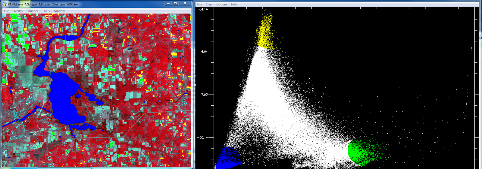
Once the principle bands are created the next step is to examine the scatter plots and find areas agriculture, bare soil, and water in the image that correspond to the selected pixel values in the histograms. In order to this I opened the scatter plots  for the PC bands 1 and 2. This is done by selecting 2D scatter plots->scatter plot band choice window. PC band 1 is selected as the X value and PC band 2 is the Y value. Once the scatter plot is open the next step is to collect end-member samples. End-members are collected by drawing a polygon or circle on the scater plot over the pixel values. This is bit of an experimental process as you don't know which LULC classes will be contained in the pixel values you select in the scatter plot however this is why the map window in open so that you can compare the selected pixel values to LULC classes in the map. When selecting end-members you can change the color of your selection and create multiple selections in the same scatter plot. Each of these selections will highlight the corresponding areas in the map in that color. Figure 2 is the scatter plot showing 3 end-member selections. Green in the scatter plot corresponds to agricultural areas in the map, yellow corresponds to bare soil areas and blue corresponds with water feature in the map. 
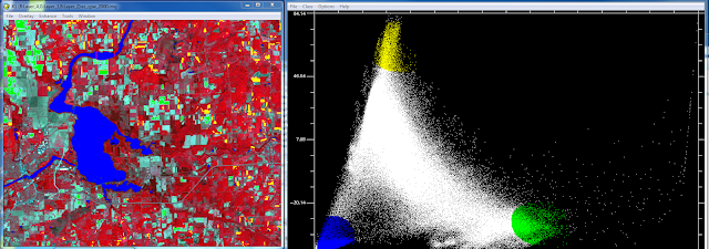
Figure 2 This is the first set of end-member selections I conducted using PC bands 1 and 2.

After we had located the agricultural, bare soil and water LULC areas in the map the next objective was to find the urban areas. Instead of using PC band 1 as the X and 2 as Y I used PC band 3 as X and band 4 as the Y. Figure 3 below is the resulting scatter plot of PC bands 3 and 4. Using the same process as before I selected pixel values in the scatter plot trying to highlight only the urban areas in the map. This proved to be more difficult than selecting the other LULC classes via the scatter plot.
Figure 3 On the right is the scatter plot for PC band 3 and 4 with the end-member slection. On the left you have the selcted urban areas higlighted as purple.
Once I was finished selecting the end-members the ROIs were saved to be used next when conducting the linear spectral mixing process. Figure 4 is what the window looks like to save the ROIs.
Figure 4 This is the save ROI window. This window tells you haow many pixels are selected in each of the end-member selections made earlier in the scatter plots.

Section 3: Implementation of Linear Spectral unmixing 

The last step in the unmixing process is to run the linear spectral unmixing. This is done by going to spectral-> mapping methods-> linear spectral unmixing. Bring in the original satallite image and then load the ROIs we just saved in the previous step. ENVI take these two inputs and creates 4 separate output images each with a different LULC class highlighted. Figure 5-8 are the resulting images. The brighter an area is in the image the more likely it is a specific LULC class. For example in the water image, water features will show up as bright white the other LULC classes will be darker grey and black.
Figure 5 This is the bare soil fractional image.
Figure 6 This is the fractional image for water. As you can see the water features were not picked out extremely well.
Figure 7 This is the forest fractional image.
Figure 8 This is the urban/built up image.

Part 2: Fuzzy Classification 

The second part of the lab was learning how to use a fuzzy classifier. The main point of the fuzzy classifier is to do basically the same task as the linear spectral mixing. It is used to identify mixed pixel values when performing an accuracy assessment. It takes into consideration the fact that there are mixed pixels within the image and that it is nearly impossible to assign those to the correct LULC class perfectly. It usese membership grades where the pixel values are decided based on whether it is closer to one LULC class compared to the others. The are two main steps in this process.

Section 1: Collection of training signatures to perform fuzzy classification 

The first step is to collect training signatures to perform the fuzzy classification.  Just as in Lab 5 I collected training samples however this time the process was a bit different. Instead of collecting only homogeneous samples like in lab 5 we collected both homogeneous and mixed samples. The collection of both types of samples gives the program a better idea of how things occur in real life. This results in a more accurate classification overall. For this lab I collected 4 water samples, 4 forest, 6 agriculture, 6 urban and 4 bare soil samples. After the samples are collected they are merged just as in lab 5.

Section 2: Performing fuzzy classification

Step 2 is performing the fuzzy classification. Performing the classification is a pretty straight forward process. Open the supervised classification window in ERDAS Imagine and pick fuzzy classification. Then I input the the signature file and which was created in the previous step. The parametric rule is set to maximum likelihood and the non-parametric rule is set to feature space. The best classes per pixel is set to 5 and then the fuzzy classification is run. Once this is run the final step is to run fuzzy convolution which takes the distance file into consideration and creates the final LULC classified image. Figure 9 is the final fuzzy classification image brought into ArcGIS and made into a map.

Results

Figure 9 This is the final LULC map for fuzzy classification method.  

Source

The Landsat satellite image is from Earth Resources Observation and Science Center, United States Geological Survey. 

Thursday, March 31, 2016

Advanced Remote Sensing: Lab 7 Digital change detection

Goals and Background

The main goal of this lab is to develop skills and get a better understanding of how to evaluate and measure changes that occur on land use and land cover over time. To do this digital change will be used which is an important tool for monitoring environmental and socioeconomic phenomena in remotely sensed images. There three objectives which fall under this digital change detection method. They are:
1)  how to perform quick qualitative change detection through visual means
2) quantify post-classification change detection
3) develop a model that will map detail from-to changes in land use/land cover over time

Methods

Part 1: Change detection using Write Function Memory Insertion 

The first portion of the lab makes use of Write Function Memory Insertion. This is a very simple yet effective method of visualizing changes in LULC over time. In order to do this the near-infrared bands from two images of the same area at different times are put into the red, green and blue color guns. When this is done the pixels that changed between those two time periods will be illuminated or be a bright color compared to the rest of the image and areas that did not change. These areas of change are then easy to see and get a quick overview of the change that has occurred between the two study times. In Figure 1 below you can see the areas highlighted in red that stand out from the rest of the the image. These are areas of change between 1991 and 2011.
Figure 1 Write Function Memory Insertion change image of Eau Claire County for 1991 to 2011.

Part 2: Post-classification comparison change detection

Section 1: Calculating quantitative changes in multidate classified images 

The next portion of the lab is about conducting change detection on two classified images of the Milwaukee Metropolitan Statistical Area (MSA). The two images being compared are from 2001 and 2011. The images were already classified and provided be Dr. Cyril Wilson. Figure 2 is the two MSA images side by side in ERDAS Imagine. 
Figure 2 These are the MSA classified images for 2001 right and 2011 on the left.
Once the two images were brought so we could visually compare the two the next step was to quantify the change between the two time periods. This was done by obtaining the the histogram values from the raster attribute table and then input those values into an excel spread sheet by class. These values are then converted to square meters and then from square meters to hectares. Once the we had the hectare values for each of the classes for 2001 and 2011 the percent change was calculated. This is done by taking the 2011 values and subtracting them from the 2001 and then multiplying that by 100. Figure 3 is the resulting table with the percent change values.
Figure 3 This table is showing the percent change for each LULC class from 2001 to 2011.

Section 2: Developing a From-to change map of multidate images 

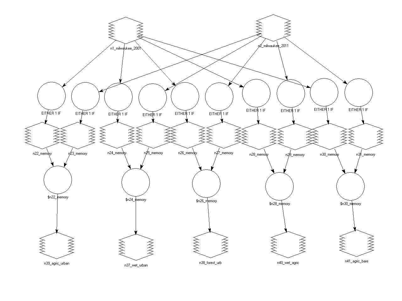
The final portion of this lab was to create a from-to-change map from the two MSA images. A model was created which detects the change between the two images. We made use of the Wilson-Lula algorithm. Figure 4 is the model that was created. In this model I focused on changes between 5 pairs of classes. Those 5 pairs are as follows: 1. Agriculture to urban 2. Wetlands to urban 3. Forest to urban 4. Wetlands to agriculture 5. Agriculture to bare soil. The first part of the model takes the two MSA images and separates them into the individual classes through an either or statement. Each class from the two years is then paired up based on the 5 pairs above. Once paired up the Bitwise function is used on each pair to show the areas that have changed from one LULC class to another over the time period. These 5 output rastersare then used to create a map of the changes that took place. Figure 5 is the final resulting from-to change map.
Figure 4 This is the from-to-change model making use of the Wilson-Lula algorithm to calculate LULC change from one class to another. 

Results

Figure 5 This is the final from-to-change map. Each are that is colored is showing a change in LULC class in the 5 pairings created earlier in the lab for use in the model in Figure 4.

Sources

The Landsat satellite image is from Earth Resources Observation and Science Center, United States Geological Survey. 

Homer, C., Dewitz, J., Fry, J., Coan, M., Hossain, N., Larson, C., Herold, N., McKerrow, A., VanDriel, J.N., and Wickham, J. 2007. Completion of the 2001 National Land Cover Database for the Conterminous United States. Photogrammetric Engineering and Remote Sensing, Vol. 73, No. 4, pp 337-341.

Xian, G., Homer, C., Dewitz, J., Fry, J., Hossain, N., and Wickham, J., 2011. The change of impervious surface area between 2001 and 2006 in the conterminous United States. Photogrammetric Engineering and Remote Sensing, Vol. 77(8): 758-762.

The Milwaukee shapefile is from ESRI U.S geodatabase.  


Tuesday, March 29, 2016

Advanced Remote Sensing: Lab 6 Classification Accuracy Assessment

Goals and Background

The main goal of this lab is to gain knowledge on evaluating the accuracy of classification results as accuracy assessment is a mandatory exercise following image classification. It is a vital part of the post-processing stage of remotely sensed data. In order to learn the accuracy assessment process there are two main objectives for this lab:
1) collect ground reference testing samples for accuracy assessment
2) use ground reference testing samples to perform accuracy assessment

Methods

The accuracy assessment in this lab was done using ERDAS Imagine 2015. 

Part 1: Generating ground reference testing samples for accuracy assessment 

The first step in the process of accuracy assessment is to create ground reference testing samples. These ground samples can be collected in the field before classification but if that is not an option they can also be created using a high resolution image as we are doing in this lab.
The first part of this lab is about creating those ground sample points using high resolution aerial imagery of our study area. The image that was assessed for accuracy is the coded unsupervised classification image created in Lab 4. First I opened this image in a ERDAS viewer and then brought in an high resolution aerial image of  the same area into another viewer. This image from 2005 and will serve as the reference image in the accuracy assessment. This image is also where the reference samples will be created. Once they are both open (Figure 1) then the accuracy assessment dialogue is opened. Select the first viewer with the unsupervised classification image and click on the raster tab > supervised > accuracy assessment. This will open the accuracy assessment window (Figure 2) in which you want to open the classified image. Next clicking anywhere in viewer two containing the 2005 imagery will select that image as the reference image for the assessment. Next random points need to be generated. This is done by going to edit > create/add random and this will open the add random points window. In this window some presets need to be changed. For this lab we did 125 in the number of points, set the distribution parameter to stratified random, the minimum number of point to 15 and selected the 4 classes from the unsupervised classification image (Figure 3). Click OK and the reference image has 125 points that appear on it.     
Figure 1 These are the two images used for the accuracy assessment. The unsupervised classification on the left and 2005 reference image in the right. 

Figure 2 This is the accuracy assessment dialogue where the classification and reference images are selected. 
Figure 3 This is the add random points dialogue where the 125 points are added to the 2005 reference image to conduct the assessment. 

Part 2: Performing accuracy assessment 

Section 1: Evaluation of reference points 

Now that the sample points are generated the accuracy assessment can begin. In the accuracy assessment window the first 10 random points are selected. Click show current selection from the view menu and these points will change appear on the reference image as white. Using the same numbering scheme for the classes from Lab 5 I went through and identified the LULC class for each of the 125 random points in the reference image. This is done by finding the point on the reference map and then looking at the unsupervised classification image from lab 4 for the LULC class and recording that in the accuracy assessment table. After each sample point is classified it will change from white to yellow.  This process can be seen in Figure 5. Figure 6 is the table is the table with the reference points in it seen in Figure 5. This is where the classification number is entered.  
Figure 5 This is what the reference image will look like after all of the random sample points have been classified. They will turn from white to yellow.
Figure 6 The are the random generated points in the table with the classification number in the left hand reference column. 

Section 2: Generating accuracy assessment report 

Once each of the 125 points is classified in the accuracy assessment window the next step is to generate the accuracy report. This is done by selecting accuracy report from the report drop down. Figure 8 is what that report will look like. To make the report easier to understand I created an Excel table (Figure 9).
Figure 8 This is the raw accuracy assessment report created in ERDAS Imagine 2015. 
Figure 9 This is the cleaned up easier to understand accuracy report I created in Excel.

Part 3: Accuracy assessment of supervised classification 

The same process was repeated from parts 1 and 2 to conduct an accuracy assessment on the supervised classification image from Lab 5 (Figure 10). 125 points were created to do the assessment and run the accuracy report. There was however an error when the report was created. Labels were not accurate and the report did not produce any Kappa Statistics (Figure 11). This malfunction may be due to an error between the algorithm used and the newest version of the ERDAS software. For his reason an accuracy assessment of the classified image has not been completed and the accuracy of the classified and unclassified images can not be compared. 
Figure 10 The supervised classification image on the left and the reference image with the 125 random points on the left.
Figure 11 This is the accuracy report containing the error for the supervised image. 

Sources

The Landsat satellite image is from Earth Resources Observation and Science Center, United States Geological Survey. 
The high resolution image is from United States Department of Agriculture (USDA) National Agriculture Imagery Program. 


Thursday, March 10, 2016

Advanced Remote Sensing: Lab 5 Pixel-based Supervised Classification

Goals and Background

The main goal of this lab is to learn how to use pixel-based supervised classification methods to extract biophysical and sociocultural information from remotely sensed images. Again just like last week doing unsupervised classification image classification is one of the most important remote sensing skills to obtain. The three smaller goals that this lab is split into are: 
1) selecting training samples to train a supervised classifier
2) evaluate the quality of training signatures collected
3) produce meaningful informational land use/land cover classes through supervised classification

Methods

Part 1: Collection of training samples for supervised classification

The first part of the lab is all about collecting training samples which will be used later for the supervised classification. These training samples are basically spectral signatures of various types of surfaces and landcover. In the last lab we relied on spectral libraries to determine what the spectral signatures we collected were from, in this lab we are picking spectral signatures a specific features from the different classes we are going to break the image into. By collecting these training samples we are telling the maximum likelihood classifier in ERDAS Imagine 2015 what spectral signature value range to expect for each different class. For our purposes in this lab we collected at least 50 training samples from the imagery. Those 50 were split into the different classes we want to divide the image into. Just like last week in Lab 4 our classes are water, forest, agriculture, urban/builtup, and bare soil. When collecting the samples we made sure that we collected multiple samples for each class to capture all of the variations of the spectral signatures of each kind of feature. This capture of  variation in signatures will help the classification tool be more accurate and classify more areas in the image accurately. For this lab we collected 12 samples from water, 11 from forested areas, 9 from agricultural land, 11 from urban/builtup areas and 7 from bare soil. This was the minimum required for the lab I ended up collecting about 65 samples total to better capture the variation of spectral signatures between classes.

The first step to collecting training samples is to bring in the image you want to classify into ERDAS Image 2015. We are again using the Eau Claire and Chippewa County imagery collected by Landsat 7 on June 9th of 2000. Once the image is open we can start collecting the samples. First we zoomed into a water feature on the map. A good starting point is Lake Wissota. Once zoomed in we used the Polygon tool from the Draw tool menu to create a sample polygon in the lake. Once the polygon is drawn we open the Signature Editor under the Supervised Classification drop down. Making sure that the polygon is still selected we create a new signature from AOI in the Signature Editor tool. Once it is added we change the name of the signature so we can keep track of what it is as we will be collecting at least 50 samples. This first sample is named Water 1. This same process is repeated 11 more times to collect the water samples making sure we look at all the water bodies and capture the spectral variations in the water features from all over the image not in just one water feature. Figure 1 is what this training sample process looks like in ERDAS Imagine 2015.
Figure 1 This is what the process of collecting training sample looks like in ERDAS.
This same process is used to collect the other 40 training samples for the forested areas, agricultural land, urban areas, and the bare soil. Water features are easy to distinguish from the other land cover features in the imagery but distinguishing between other feature surfaces can be difficult. To help with this we linked and synced a Google Earth viewer window to the false color image. This allows the user to zoom into areas on the false color image which they think is agriculture and look at the high resolution Google Earth imagery to double check. This is repeated for all the land cover features to make sure the training samples are capturing and classified as the right land cover type. Figure 2 is what the Spectral Editor tool will look like once the samples are collected.
Figure 2 This what the Spectral Editor window will look like once all the samples are collected and classified.

Part 2: Evaluating the quality of training samples

The next step in the lab is to check the accuracy of the training samples that were collected. This is a vital step before they are used in the supervised classification tool. What you are looking for when assessing the sample quality is separability between the spectral signatures in each each class. The more separability there is between the spectral samples in each class the better you at capturing the full range of spectral values for that class and the better the classification will work. In simple terms the less over lap there is in the spectral signatures the better. We look at this separability using the Display Mean Plot Window button in the Signature Editor window. We highlight the samples we want to display in the editor window and then click the Mean Plot tool. Figure 3 is how this looks in ERDAS. When this window opens sometimes the signatures are scrunched and you can not see all 6 bands. We fix this by hitting the Scale Chart to Fit Current Signature button. By looking at the patterns of the signatures across the six bands we can do an early rough determination of how accurate the samples collected are. All of the bands should have the same overall pattern across the 6 bands, showing they are of the same type of feature, but they should not be overlapping, to show the variation of signatures in that feature.
Figure 3 This is how to display the spectral signatures under each class to do separability comparison. 
During this process we are looking for signature that are drastically different pattern wise across the 6 bands from the other signatures of similar classes. For example if you have a agriculture signature that has a completely different signature pattern than the rest that sample should be deleted and recollected to improve accuracy. Once we have done this we bring all of the signatures in to the same window to view them as a group. They are color coded in the following way. Water is blue, Forest  is green, Agriculture is pink, Urban is red, and Bare Soil is sienna. Figure 4 is all of the training samples displayed in the same signature window.
Figure 4 These are all the signatures of my collected training samples displayed together. 
Once we have looked at the signatures the final step in the accuracy process is to create a separability report. This is done by clicking on the Evaluate then Separability buttons in the Signature Editor Window. Making sure that all the signatures are selected open the Signature Separability tool. For this lab we chose 4 layers per combination and transformed divergence as the distance measurement. We then click OK to generate the report. Figure 5 is what that report looks like. This report is basically a numerical way of showing the separability between the collected training samples. We see values of 0 to above 2000 in the charts produced. We are looking for values between 1900 and around 2000. Good separability is 1900 and above, 2000 and above is excellent, and anything below 1700 is garbage and needs to be recollected. It also tells us which bands have the most separation between them and for my report my best bands were 1,3,4 and 5 with a Best Average Separability value of 1987 which is good.
Figure 5 This is part of the separability report. Showing the most separated bands as the Best Average Separability value.

Upon getting a good separability value the final step before running the supervised classification is to combine the spectral signatures in each class into 1 signatures representing the whole class (12 water signatures combine to 1). There will be 5 bands total after this is complete, one for each class. To do this we highlight all the signatures for one class, so all the water signature, and go to edit, Merge from in the Signature Editor window. Figure 6 are the final 5 merged classes. We then plot these 5 in the Mean Signature Window, the result is Figure 7.
Figure 6 The merged class signatures. 
Figure 7 The merged signatures displayed in the Mean Plot window.

Part 3: Performing supervised classification

We are now ready to run the supervised classification which is very simple once the prep work in Parts 1 and 2 is complete. We run the tool by clicking Supervised Classification from the Classification tab under the Raster menu. This opens the classification settings (Figure 8). The input image is the original Eau Claire 2009 image and the signature file is that which we created in Part 2 when we merged the signatures into 5 classes. The classified file is the output image so we save that where you like and all other defaults are accepted. We run the tool and view the result (Figure 9) in the Results section below.
Figure 8  The supervised classification window. 

Results

Figure 9 This is the final supervised classification map of Eau Claire and Chippewa counties.
Figure 10 This is a comparison of newly supervised classification image on the left compared to the unsupervised classification image done in lab 4 on the right. We see that there is quite a difference in the two images. 

Sources

The Landsat satellite imagery is from Earth Resources Observation and Science Center, United States Geological Survey.